

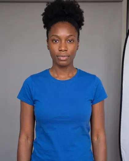
What a neutral undertone means
A neutral undertone is not a lack of color. It means the warm and cool qualities in your skin are close to balanced, so neither a golden nor a pink base clearly wins. You will often recognize it from mixed signals: blue-green veins, both metals looking fine, foundation labeled neutral matching best, cream and white both acceptable.
Mixed answers are common. If a quiz forced you into warm or cool and the advice never quite worked, neutral may be the better description. The undertone test returns neutral when your warm and cool answers are close, and tells you if you lean slightly one way.
Find your lean
Most neutral people still lean a little. That lean decides which edge of the palette to explore first:
- Neutral-warm: gold looks slightly better than silver, cream slightly better than white. Add soft corals, warm teal, camel and olive.
- Neutral-cool: silver edges out gold, white edges out cream. Add dusty rose, soft blue, plum and charcoal.
- True neutral: you cannot tell. Stay in the middle and judge each color by its depth and clarity instead.
The neutral palette, by depth
Colors in the middle of the wheel, not too yellow, not too blue, tend to suit neutral skin best. Depth decides how light, dark and saturated to go.
Fair and light neutral skin
Soft mid-tones look balanced: dusty rose, jade, soft teal, periwinkle, blush, sage and watermelon. Very dark or very bright colors can dominate a fair neutral face; keep them further from the neck or soften them with a lighter layer.
Medium and tan neutral skin
This depth can wear the most: teal, true red, jade green, dusty blue, plum, soft coral and aubergine.
Deep neutral skin
Saturated middle colors make strong contrast: teal, true red, emerald, cobalt, magenta and golden ochre, plus bright white. See the guide to colors for dark skin for more.
Colors that work for almost everyone
If you are shopping for someone else, or building a wardrobe for a household, these are the colors that tend to suit the widest range of people, and they are home ground for neutral undertones:
| Color | Why it works widely |
|---|---|
| Teal | Sits between green and blue, and between warm and cool. |
| True red | Neither orange nor blue-pink, so it rarely clashes. |
| Cobalt | Clear and saturated without being neon. In our draping mirror it was among the strongest colors on all three sitters. |
| Jade | A soft, slightly blue green that avoids yellow-green. |
| Soft white | Brighter than cream, gentler than optic white. |
| Navy | Darker than mid-tones but softer than black. |
Neutrals and metals
Your neutrals can come from either side: soft white, taupe, mid gray, navy and espresso brown all tend to work. Black and camel both work too; choose by your lean.
Gold and silver both usually look fine on neutral skin, so pick by the outfit. Rose gold, mixed metals and brushed finishes are especially easy.
The edges to test
Neutral skin can lose its balance at the extremes. Before buying, test:
- Neon and acid brights such as neon yellow or orange, which can overpower the face.
- Very dusty, gray-beige shades close to your own skin, which can blend in and look flat.
- The far ends of either palette: very orange coral, or very icy blue. Moving one step toward the middle usually fixes it.
Clarity matters more than temperature
Because temperature is balanced for you, the bigger decision is often clarity: clean, saturated colors versus soft, muted ones. If cobalt and true red make you look sharp, go clear. If they seem to wear you, try teal, dusty blue and plum. Your contrast level (how much your hair and eyes differ from your skin) is the best clue: high contrast tends to suit clear colors, low contrast tends to suit soft ones.
Check it on yourself
Take one warm and one cool version of a color, such as coral and rose, and hold them under your chin in daylight. If neither clearly wins, hold up a middle version, such as watermelon. For a neutral undertone, the middle often wins. That is your sign to shop the center of the wheel.
See a color on your own photo
Shopping for something in this palette? Upload a photo of yourself and a photo or shop link of the garment. FitInView creates a try-on image of you wearing it, so you can compare it with the version you are unsure about.
Try it on your own photoCreate a free account
Your first try-on is included with a free account. No card needed. Your photos are private to your account, and you can delete them.